Two registers: an editorial landing page, a clinical terminal
A trading interface for perpetual futures that sells calm rather than adrenaline — terminal, order book and swap widget included.
- Branding
- Web design
- UX design
- Design system
- Frontend development
- Performance
- Role
- Concept, design & development: DeNitro
- Scope
- 4 routes, 2 product surfaces
- Stack
- Next.js 16, React 19, Tailwind v4
nilo is our own production for a category in which almost every interface shouts: crypto trading platforms work with neon green, countdown pressure and maximum information density — and hide the risk exactly where it blinks loudest.
We wanted to build the opposite: a working environment for considered execution, in which the risk position is visible and the colour suggests no emotion. The claim could only be proven by building both the brand and the actual product.
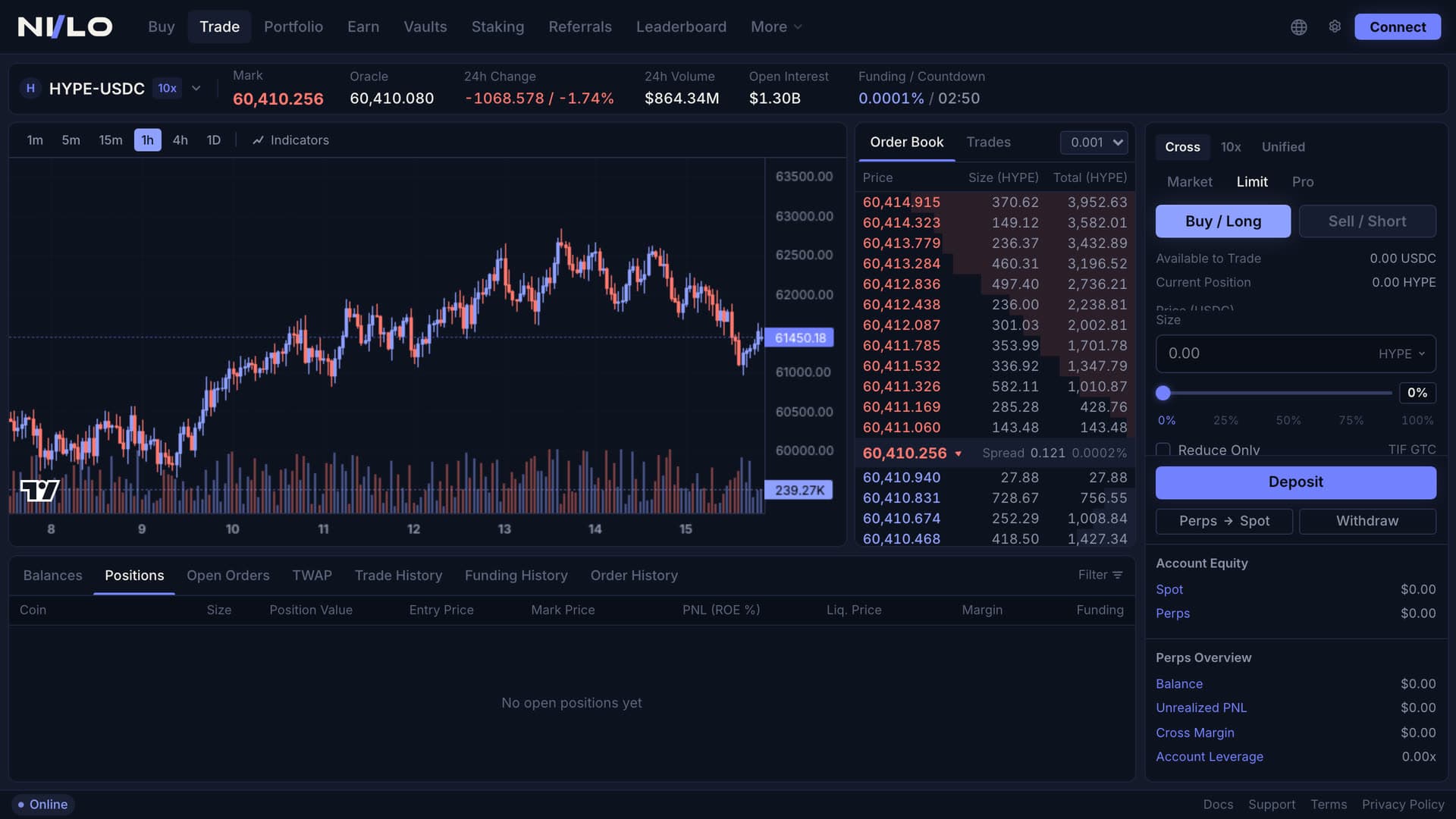
The most conspicuous decision is in the colour system: long is not green. The buy and sell sides both sit on muted tones — a lilac for the buy side, a restrained red for the sell side. That removes from the interface exactly the reflex trading platforms otherwise trigger on purpose.
Typographically two worlds are set against each other: an italic-capable serif used only for large statements, a dense grotesque at a 13-pixel base size for the whole application. The contrast carries the two registers — landing page editorial, terminal clinical.
The landing page does not show a screenshot of a product, it shows the product: the hero embeds the real terminal route in a desktop frame and a phone frame. What runs on the home page is the application itself.
The home page is structured as hero, features, transparency, community and closing CTA, joined by smooth scrolling and continuous grid lines. The background is a hand-built ASCII wave field on canvas: mouse-led, with up to four simultaneous click waves and an optimisation documented in the code — pre-rendered character strips, block-wise drawing, lookup tables for trigonometry and distance, an upper bound on the cell count and a fixed frame-rate budget.
The terminal is a fixed screen shell: a header with the trading pair, a candlestick chart with a volume histogram, an order book with sixteen levels per side whose spread opens outwards, whose depth bars are drawn through a CSS variable and whose rows flash briefly on a price change. Next to it an order form with buy and sell sides, three order types, margin modes, percentage steps, reduce-only and take-profit/stop-loss — and below that a positions table, an account panel and a status bar.
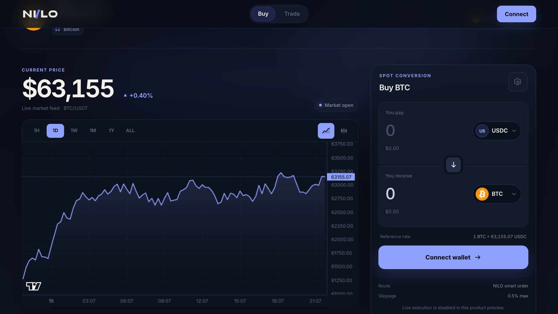
The buy page works with real prices: it queries a public market data endpoint every fifteen seconds, aborts in-flight requests cleanly, pauses on a hidden tab and falls back to a stored state on failure — and then labels it as such ("reference market state" rather than "live"). Alongside it a swap widget with token selection in an overlay, search, page-scroll locking, escape to close and its own slippage setting.
What was built
Everything that is in nilo — conceived, designed and built by DeNitro.
- Brand picture: token set for surfaces, borders, text levels and signals
- Landing page with five sections and continuous grid lines
- ASCII wave field on canvas, optimised for the purpose
- Three live-animated feature widgets (chart, order book, risk)
- Trading terminal: chart, order book, trades, order form, positions
- Buy page with a real price feed and an honest fallback label
- Swap widget with token selection, search and slippage setting
- Statically generated asset pages with their own metadata
- Component and feature architecture for three product areas
What that changes
Four points where the work is readable in the interface itself. Figures on revenue or reach are deliberately absent — this is our own production, not a client campaign.
Colour without the reflex
Long is lilac rather than green, short a muted red — the interface informs instead of pushing.
The home page shows the product
Instead of a screenshot, the real terminal route runs inside the device frames of the hero.
An honest data state
The buy page visibly distinguishes a live price from a stored reference state — the user always knows what they are looking at.
Performance as a design question
The background field is built to a fixed frame-rate budget, the chart-heavy routes load only in the browser, and the price query pauses in the background.
The stack behind nilo — and the decisions that mattered enough to write down.
- Next.js 16 App Router with React 19 and TypeScript; asset pages via generateStaticParams with dynamic params switched off.
- Tailwind CSS v4 purely through an @theme block, with no config file; the buy page additionally carries a CSS module of its own.
- Feature-oriented folder structure: landing, trading and buy each with their own components, hooks, utilities and types.
- Charts through lightweight-charts; the chart-bearing routes are loaded dynamically and without server rendering.
- Market data comes from a public, unauthenticated ticker endpoint — with AbortController, a visibility check and a fallback.
- Smooth scrolling through Lenis, motion through Framer Motion; the canvas field evaluates the reduced-motion setting on start.
- The terminal is deliberately built for large screens; the home page and the buy page are fully responsive.
An app in which the pace of the interface is the number
A Telegram Mini App in which a token burns faster the more the network talks about it — and in which that rate appears nowhere as a number, but as the colour and the pulse of a sphere.
View caseWhere is your digital growth leaving money on the table?
In 15 minutes we look at where customers find you today, where the potential is being lost, and which lever is worth pulling first: website, SEO & GEO, conversion or automation. You leave with a clear next step — even if we are not the ones who take it with you.