An app in which the pace of the interface is the number
A Telegram Mini App in which a token burns faster the more the network talks about it — and in which that rate appears nowhere as a number, but as the colour and the pulse of a sphere.
- UX design
- Design system
- Frontend development
- Motion design
- Accessibility
- Role
- Product and design lead: DeNitro (then trading as NEXA)
- Scope
- 4 areas, Telegram Mini App
- Access
- Public preview against a mocked backend
TrendArena is a Telegram Mini App with an unusual mechanic: how fast the supply of a token burns depends on how much the network is currently talking about it. The rate is computed on the server and never arrives as a number a holder could react to.
So the design question was not how to display that number, but a harder one: does a reader who has fully understood the mechanic even have a move to make? The first version answered no — it was not patched, it was thrown away entirely.
Then the form: a Mini App runs in a chat, on a phone, in a web view. There is no onboarding flow, no second column and no room for explanatory text. Every screen answers exactly one question, or it answers none.
The rate does not become a label, it becomes the object: the colour is the band, the pulse is the speed. A cold token breathes every 6.5 seconds, an extreme one every 2 — the temperature has been read before any number has. Four bands, four multipliers, and "cold" is a floor rather than a trough: a very cold token could also have generated supply, and that was explicitly rejected.
For everything outside that module the opposite applies: black surface, exactly four surface values, no borders, no dividers, no shadows, no gradients. Hierarchy comes from typography and spacing — anyone reaching for a rule has used too little space. Per screen there is exactly one dominant object and exactly one bright action.
The rule that cost the most is called "say it once". An early build read well as a screen and catastrophically as a flat text list: the same countdown five times, the same burn figure three times, the mention count in two different formats — a reader saw two values for one quantity and had to guess which one applied. Two entire sections were deleted. Since then every screen is read as a text extract before shipping: duplication is invisible in a mockup and obvious in an extract.
The chart grammar was argued out rather than assumed: mentions are counted, discrete quantities and belong in bars that start at zero; a price is continuous and belongs on a line. For the same reason the chart library was replaced rather than restyled — every one of its rendering defects sat at a load-bearing point, and a hand-drawn SVG is around 200 lines with full control. You take a library for its behaviour, not for its picture.
And two controls became one: candle interval and visible period sat side by side with a table of incompatible combinations between them. Today the period derives the interval — and drives the statistics window and the change in the header at the same time. One control, one period, one explanation fewer.
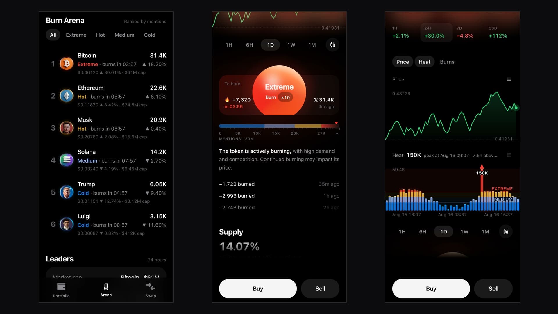
Four areas carry the app. The portfolio shows holdings, history and cash across six periods. The "Burn Arena" is sorted by mentions and filterable by band; every row carries its band, its countdown to the next reduction, price and market value. The token page is the depth. The swap is the action.
The thermal module is the sanctioned exception to the rule set and the only place with a gradient, a hue and continuous motion. The sphere consists of eight stacked layers whose periods — 28, 22, 11 and 9 seconds plus the band's heartbeat — have no common multiple: the surface visibly never repeats. It is drawn once at full size and scaled down, its content counter-scaled, so the type keeps its physical size when it collapses.
The top edge of the screen glows at the intensity of the current rate — and below 0.1 it is not drawn at all. That is the same stance as in three other places: with no cost basis the half-sentence is dropped rather than printing "NaN"; with no holder share there is an em dash. An empty spot is information, a broken one is debugging for the reader.
The same timeline is readable three ways: as price, as heat and as burn. Below it sit supply, key figures and a trade tape in which a burn is a row like any other — it stands between buys and sells, because in the holding that is exactly what it is.
Gestures had to be arbitrated, because three of them overlap here: the page scrolls vertically, the chart pans horizontally, and the panel around it can be dragged to reorder. Nothing claims a gesture before the finger has travelled eight pixels and the direction is unambiguous; the outer drag gets a handle of its own and nothing else, the inner surface keeps the vertical scroll. There is no contested area.
Operability is written down in the same document as the look: a 44-pixel minimum target for every tap, a label on every icon button, states through aria-pressed and aria-expanded, measured values as `meter` with a minimum and a maximum. Direction is never carried by colour alone — a sign is always there. And a hidden state really does leave the accessibility tree instead of merely turning transparent: otherwise a screen reader reads out the collapsed and the expanded version one after the other.
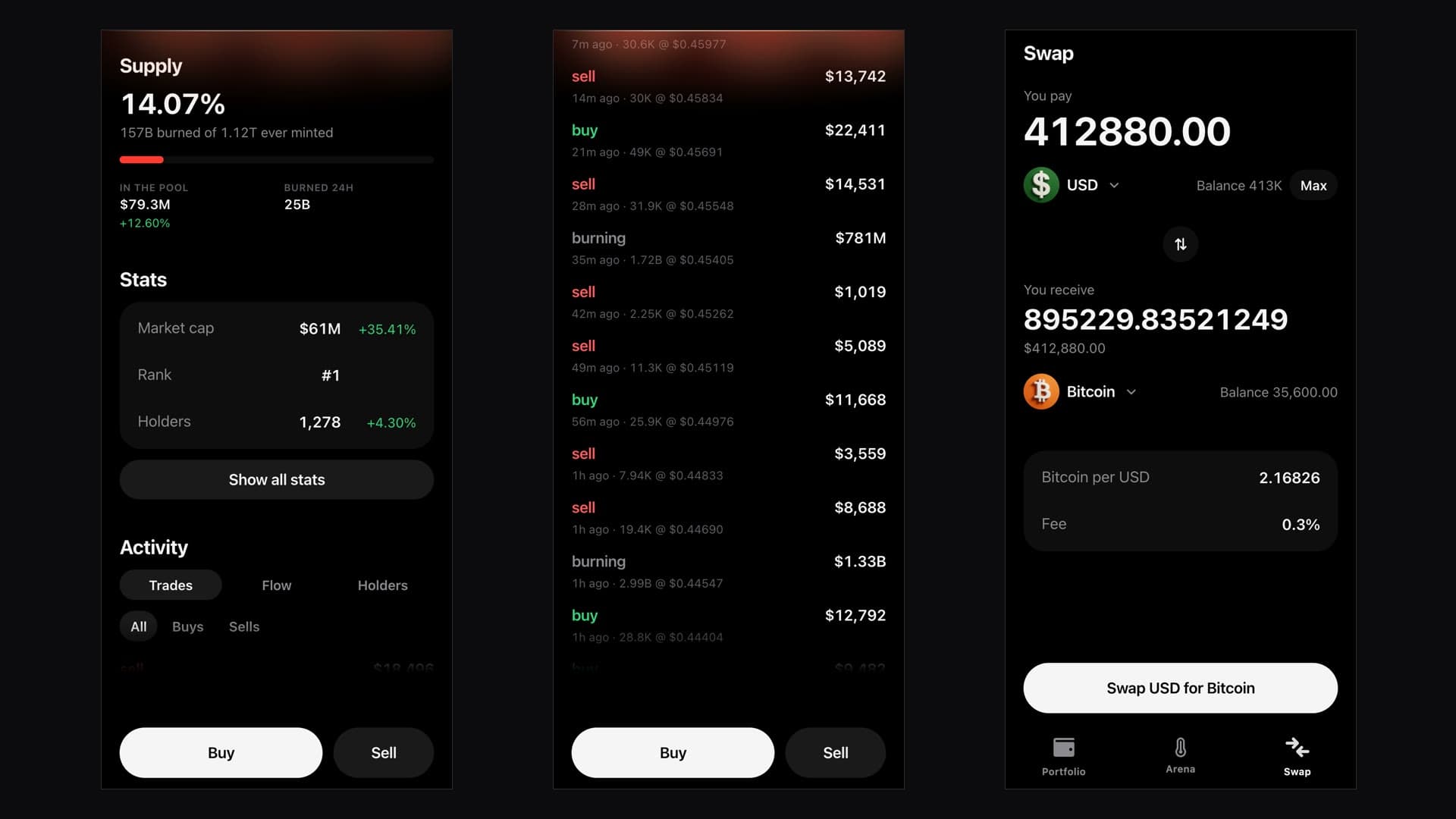
More screens
Captures of the shipped interface — TrendArena, three screens per image.
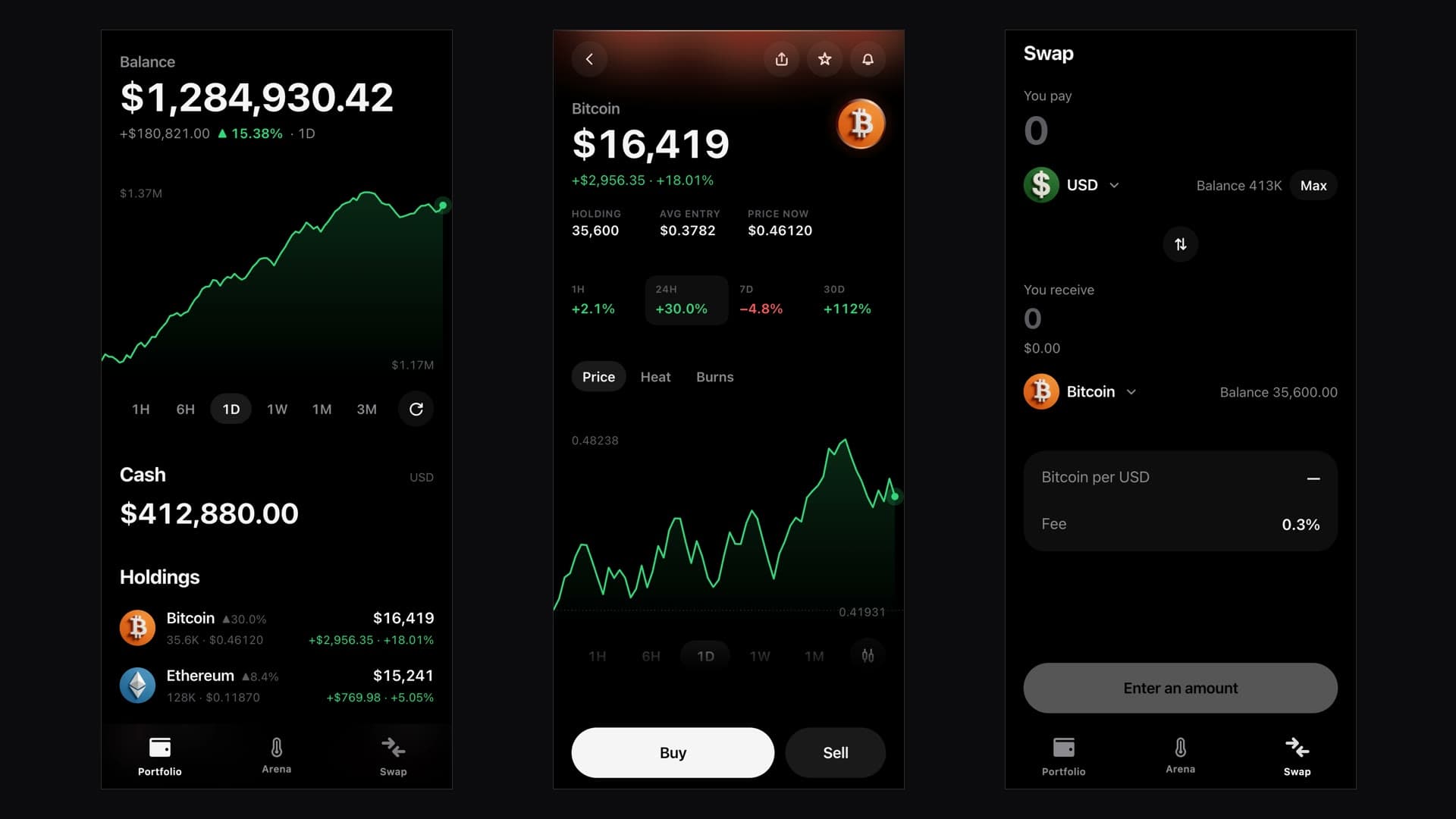
What was built
Everything that is in TrendArena — conceived, designed and built by DeNitro.
- Four areas: portfolio, Burn Arena, token page, swap
- Design law as a document: seven rules, colour, type, space, radius and motion tokens
- Thermal module: four bands with their own palette, heartbeat and edge glow
- Sphere of eight layers with coprime periods, drawn once and scaled
- Ranking by mentions with band filters and a countdown per row
- Three readings of one timeline: price, heat, burn
- Hand-drawn SVG charts instead of a library
- One period control driving interval, statistics window and header delta
- Trade tape with burns as their own row type
- Swap with rate preview, fee disclosure and the action locked without an amount
- Gesture arbitration between page scroll, chart pan and panel drag
- Accessibility rules: labels, states, `meter` roles, signs instead of colour
- Central number formats including fixed-width countdowns
- Decision log: what was rejected and why
What that changes
Six points where the work is readable in the interface itself. Figures on enquiries, revenue or rankings are deliberately absent — we do not publish our clients' business numbers.
The rate is the object
Colour is the band, the pulse is the speed — 6.5 seconds when cold, 2 when extreme. The temperature has been read before a number has.
Every number appears exactly once
An early build showed the same countdown five times and one quantity in two formats. Since then every screen is proofread as a text extract before shipping.
One control instead of two
Period and candle interval had a table of incompatibilities between them. Today the period derives everything else — statistics window and header delta included.
Honest absence
With no cost basis the half-sentence is dropped, with no holder share there is an em dash, and below 0.1 intensity the edge glow is not drawn at all — instead of "NaN" or an empty pair of brackets.
No contested surface
Page scroll, chart pan and panel drag lie on top of each other and still do not interfere: eight pixels and an unambiguous direction decide who gets the gesture.
Operable, not just visible
A 44-pixel minimum target, a label on every icon button, a sign rather than colour for direction — and a hidden state leaves the accessibility tree instead of being read out twice.
The stack behind TrendArena — and the decisions that mattered enough to write down.
- Telegram Mini App: the public preview replaces the Telegram SDK with a stub and answers every request from stored data — it opens in an ordinary browser and reaches nothing real.
- Design law and code sit next to each other: colour, type, space, radius and motion tokens in one file, the component vocabulary in the next, number and time formats in the third. No screen may introduce a colour, size, duration or format that is not in there.
- Four bands each with their own palette rather than one accent — the sphere is built from stacked gradients, and every layer needs its own colour stops.
- Heartbeat per band: 6.5 s (cold), 5.0 s (medium), 3.2 s (hot), 2.0 s (extreme); the edge glow follows the same order and stays undrawn below 0.1.
- The sphere isolates its blend modes (`isolation: isolate`) so the eight layers do not tint the page behind them.
- Blur stays under 20 pixels — above that the frame rate collapses in Safari.
- A change is one continuous value, not a swap between two states: a tap mid-motion reverses from wherever the animation currently stands.
- Band thresholds are recomputed once a night from the previous day's figures and then held for the whole day — otherwise the line wanders out from under the reader while they watch it.
- Charts are hand-drawn SVG; the previous library was replaced because every one of its rendering defects sat at a load-bearing point.
- Number formats are central: compact large values, exact amounts up to 100,000, an always-visible sign, and fixed-width countdowns so a ticking row does not jitter.
Where is your digital growth leaving money on the table?
In 15 minutes we look at where customers find you today, where the potential is being lost, and which lever is worth pulling first: website, SEO & GEO, conversion or automation. You leave with a clear next step — even if we are not the ones who take it with you.